Experimental working prototypes from my Master's in UX Design & Data Visualization at FHGR. Vibe and selfcoded.
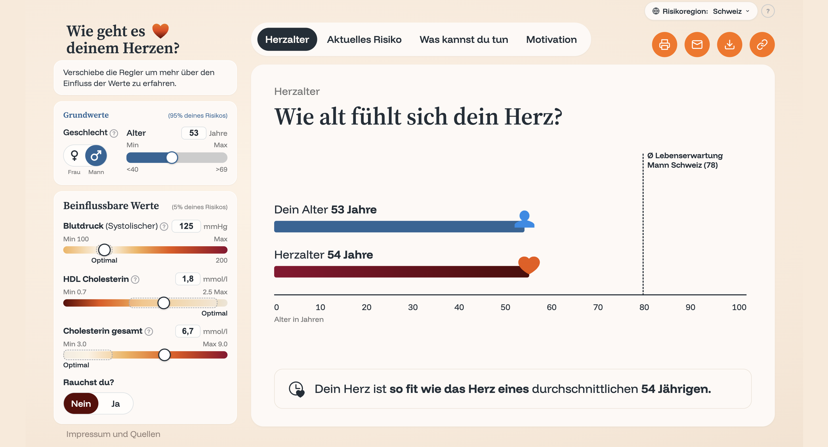
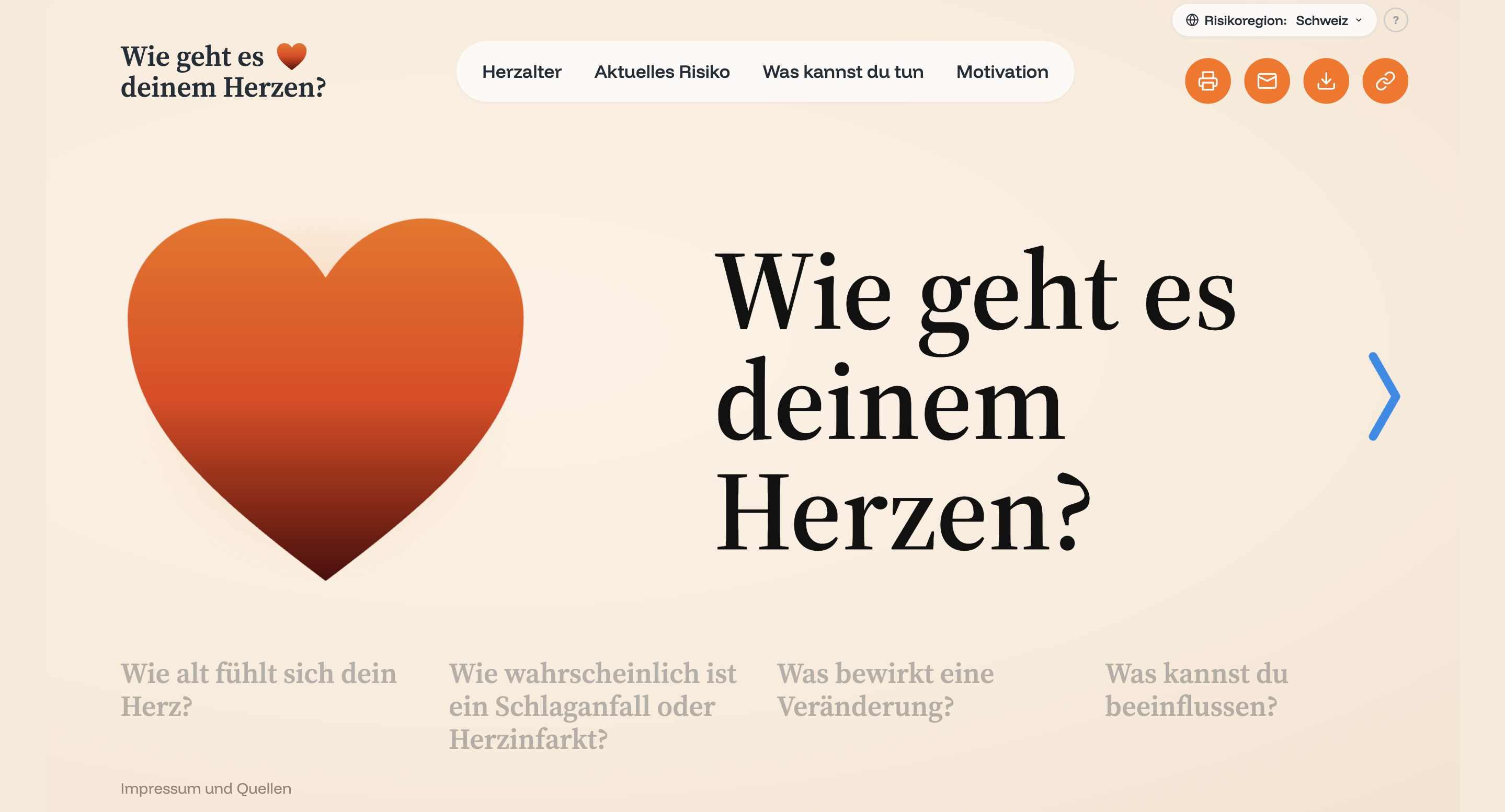
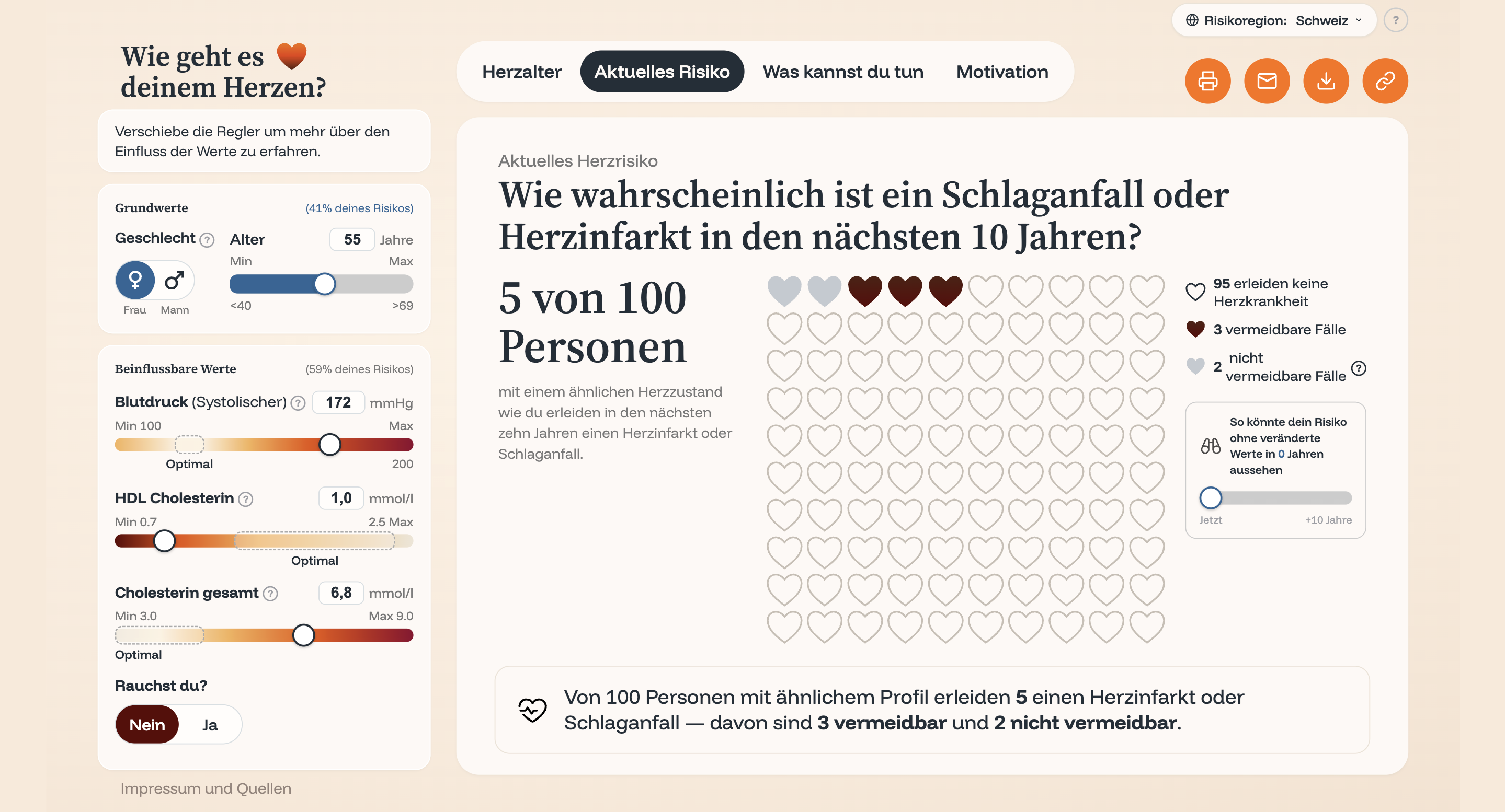
Cardiovascular risk calculator Masterthesis: Making cardiovascular risk understandable through data visualization. Developed iteratively via Figma → Claude Design → Claude Code.
https://herzrisikorechner.onrender.com/index.html
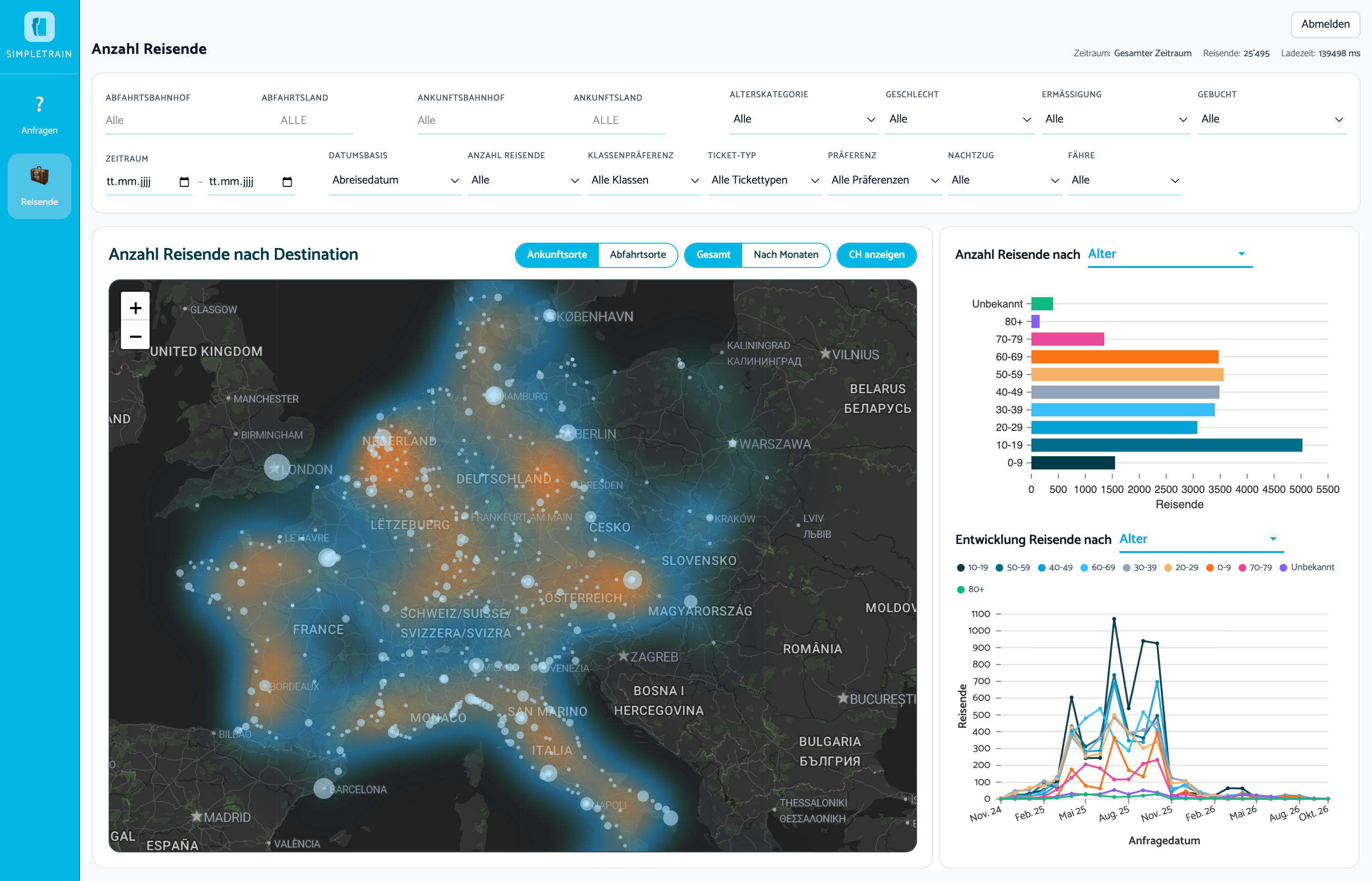
Live train travel dashboard Connecting and visualising the SimpleTrain database (images show dummy data), built with Python, FastAPI, React and Plotly.
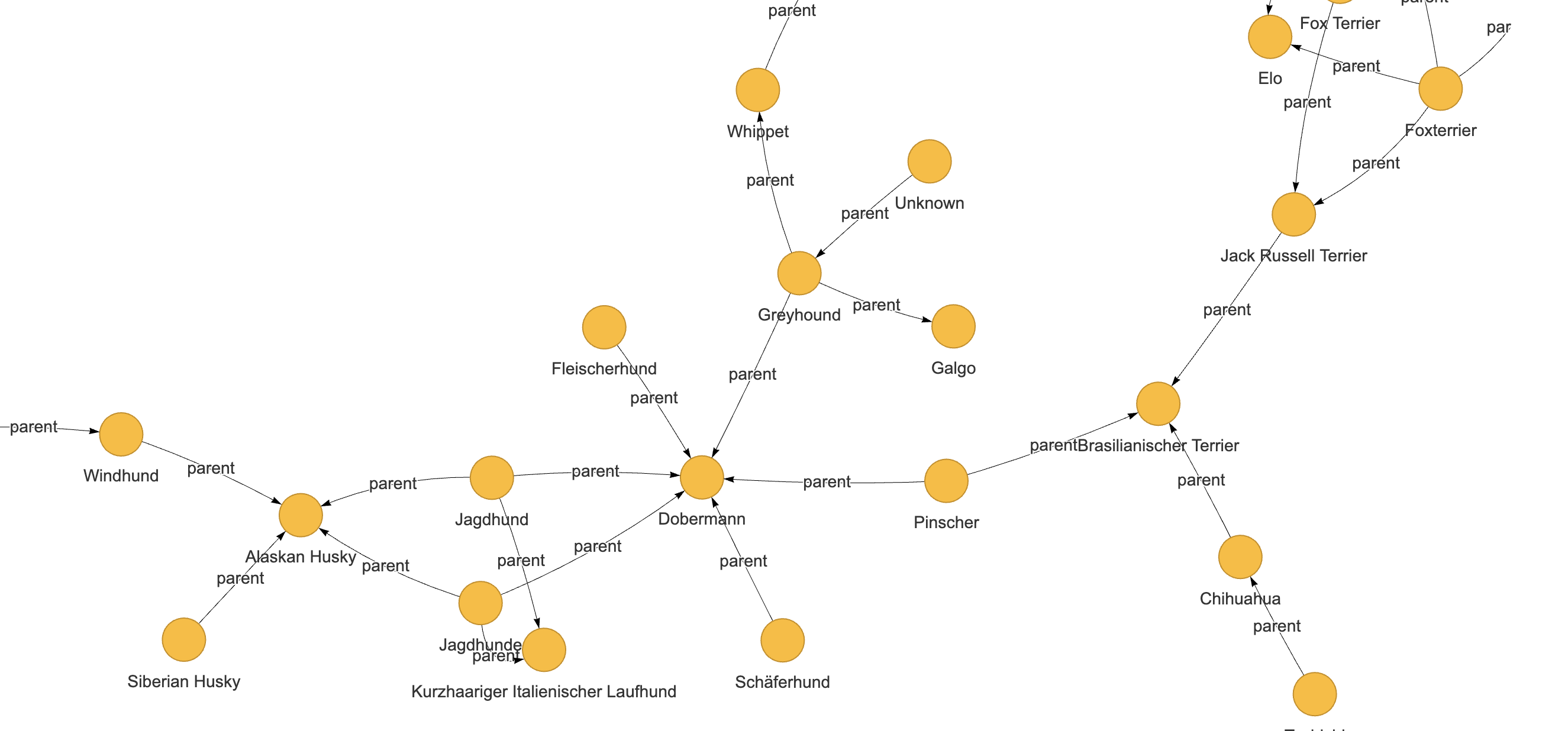
Dogumentation Enriching Zurich's dog register with DBpedia/Wikipedia knowledge (breed size, origin, type) to explore paw-terns. SPARQL/RDF knowledge extraction combined with Streamlit.
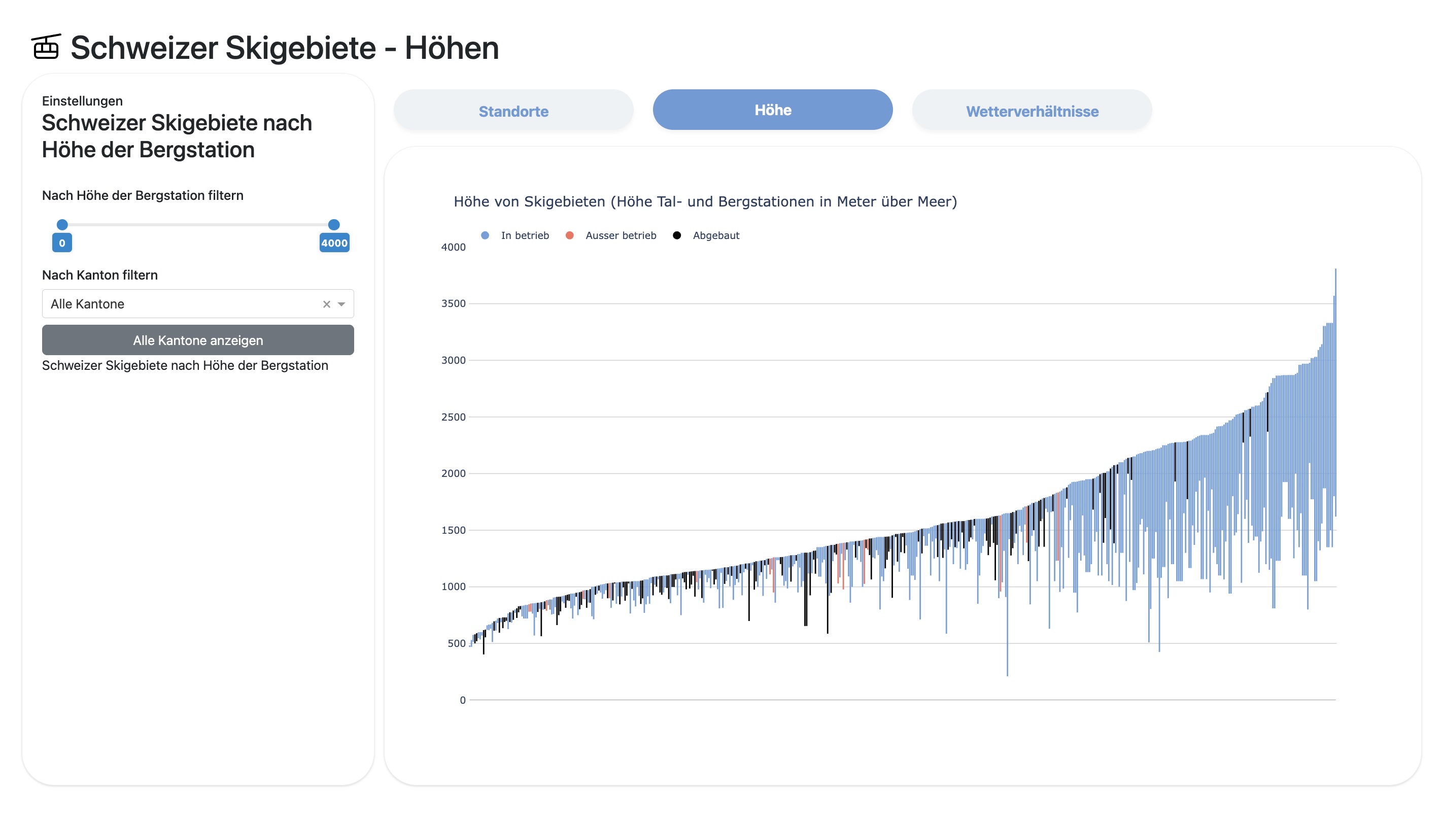
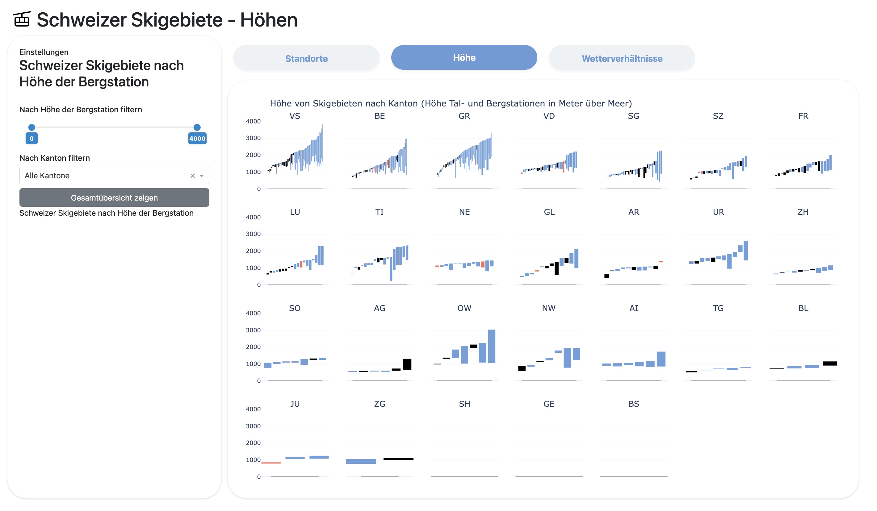
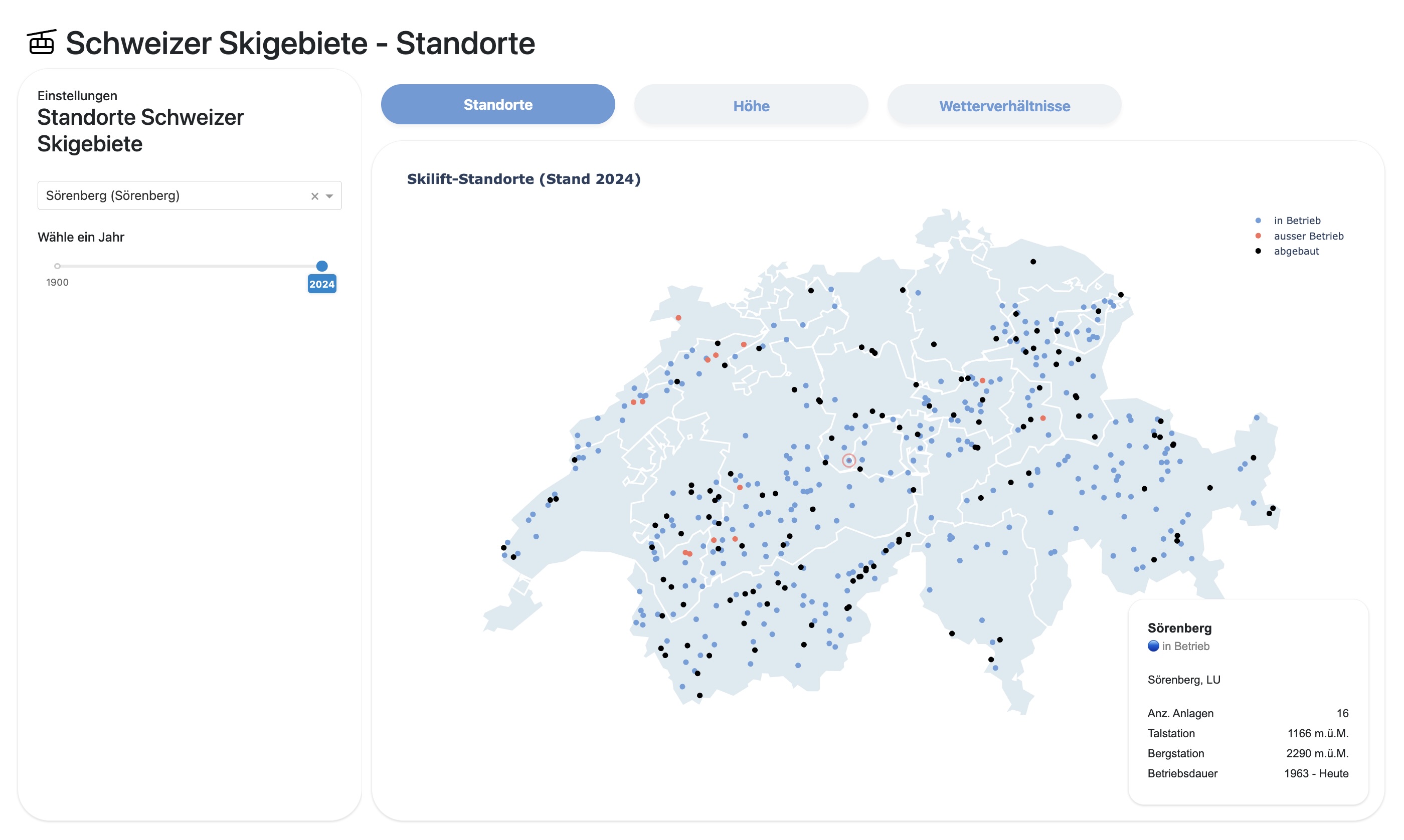
Swiss ski lifts Analysing patterns in closed/decommissioned Swiss ski lifts in relation to weather and climate data, built with Dash.
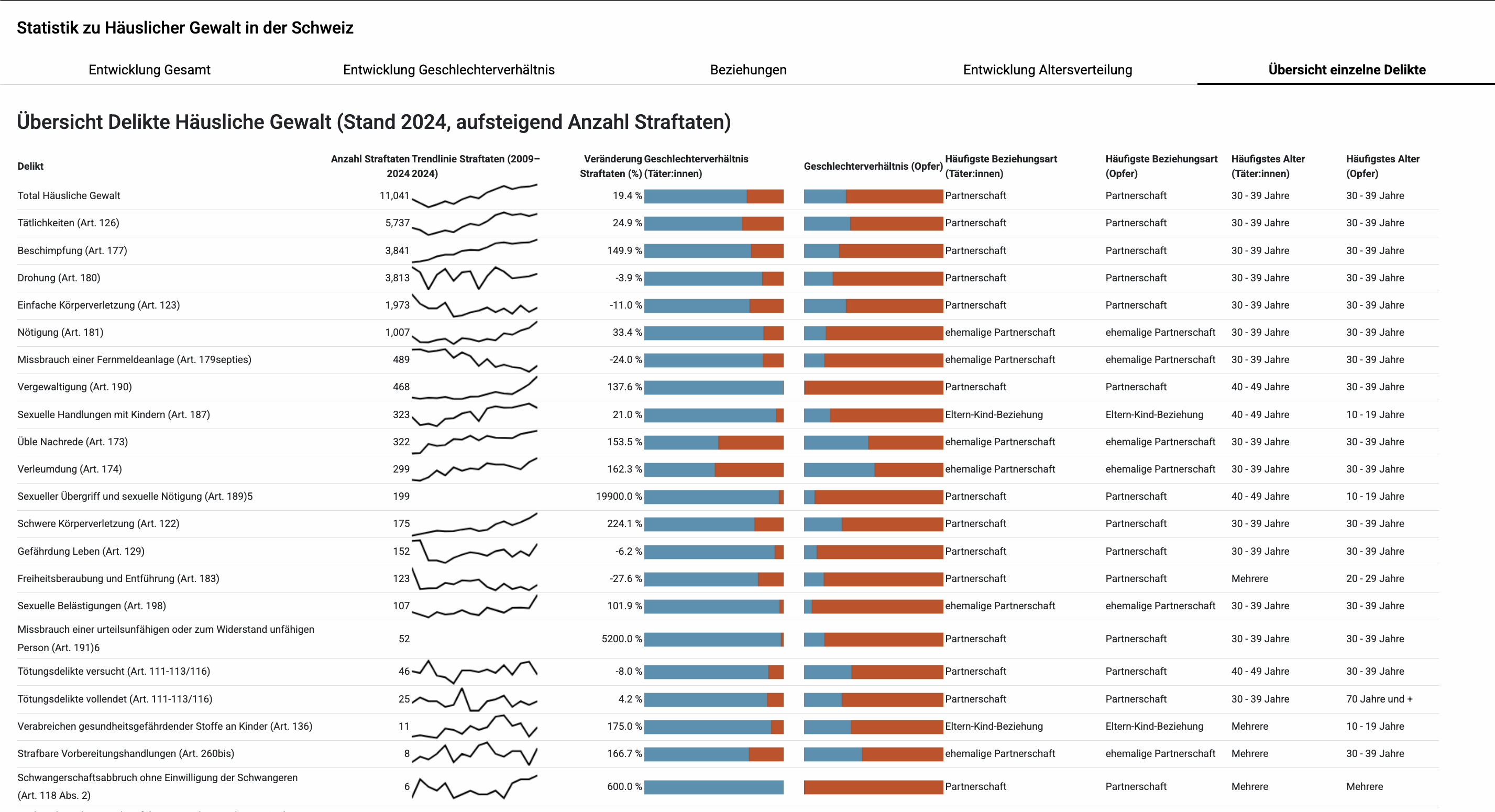
Domestic violence dashboard Built with Dash.
Coded
dataviz
projects FHGR
2024-2026
Master User Experience and Data Visualisation, FHGR Chur
Coding, Interaction, Web Prototype, SPARQL, Streamlit, Python, JS